Tag: reviews

  • Comic Comments – Something’s Gotta Give

    Comic Comments – Something’s Gotta Give

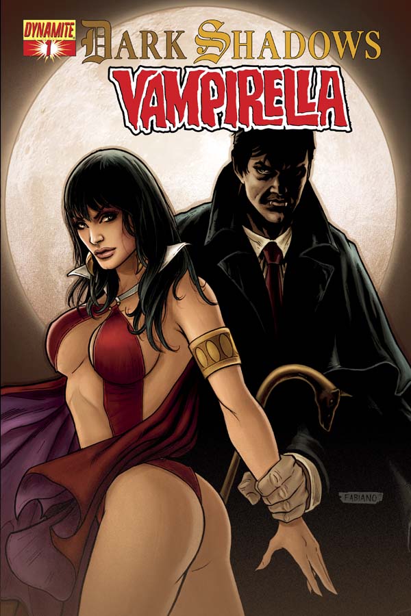
    DSV 01 Cover

    I get a lot of comics. Well at least it seems that way each month when the box arrives and I look at the bill. So I have to keep my list down to 25 or less titles. There are times something has to give to get a new title. That is what happened to Dark Shadows Vampirella. I got the title because the pairing struck me as amusing but after three issues the joke wore thin and better reviewed titles like Think Tank were coming available. So the ax fell on DSV. If funds were unlimited I’d keep it, but alas they are not and the magic number of 25 must be maintained even if it means staking Vampirella and Barnabas through the heart.

    First the legal disclaimer: All images are the property of their owners I reproduce them here under the Fair Use Doctrine of the copyright law for commentary and critique. No more than three pages total from any one issue is reproduced.
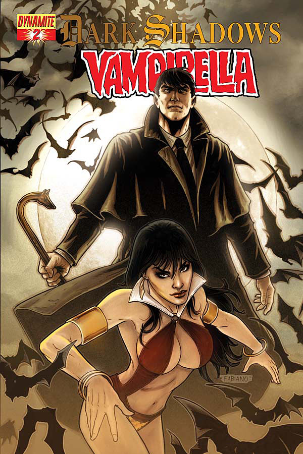
    DSV 02 Cover

    Now to give credit to the creative team – Marc Andreyko, Writer – Patrick Berkenkotter, Illustrator Issues 1 & 2 – Jose Malaga, Illustrator Issue 3, Thiago Ribeiro, Colorist – Troy Peteri, Letterer – Covers by Fabiano Neves – and Special Thanks to Jim Pierson.

    The story centers on a vampire killing in NYC. Barnabas has vowed as part of his penitence for the years of killing he did before he gained control of his powers to watch over his victims’ families protecting their descendants. Vampirella is put on the case by her just started wearing drag detective friend. Well I really don’t think it’s a drag queen detective but from the art it appears that way.

    We eventually get the meeting of the two heroic Vamps. Holding to comic book tradition they have to fight first then team-up. I thought great we got the fanboy ‘what if Barnabas and Vamp fought who’d win’ battle out of the way but no, oh no I couldn’t be so lucky. The whole story is follow the comic book crossover book of cliches. The sidekicks like each other and mock their respective partners. For me the joke of the liberated vampire woman and the Victorian vampire man team up wore thin before the third issue.

    Sure like I said if funds were no problem I’d hold on for the few laughs an issue offers, sometimes it’s fun to mock the cliches by OVER doing them with the sidekicks. But alas this is not to be. When a culling had to happen to let in better written titles, this was the weakest on the list.
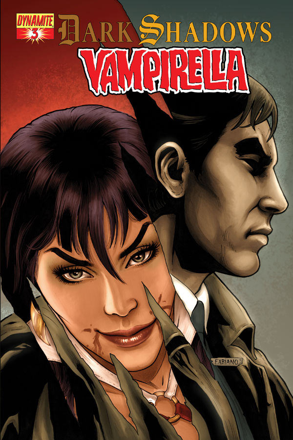
    DSV 03 Cov

    As for the art – I prefer Berkenkotter’s style for Dark Shadows, it’s more the line intensive old comic style. It’s a great style except for the unfortunate depiction of the female/drag wannabe queen detective. Still over all I prefer his style for this tale over Malaga’s more modern superhero style. I think the tale of an ancient evil vampire fighting two well established vampires deserves a more classic treatment. No disrespect to Malaga’s art I just think I’d enjoy him more on a superhero tale. I will say he can do excellent comic nudes…

    The covers are okay. I can’t say I’m swept off my feet by them. Vampirella broke her back for issue one so she could give us a T&A ‘Kay’s Open Heart’ pose. Really living backs can’t don that I don’t think the undead that aren’t zombies can either. If a zombie did it I’d suspect it couldn’t stand, due to becoming a paraplegic from the broken spine. As for the other two covers, I like them. They are nice. Just not WOWZERS for me.

    So alas poor Dark Shadows Vampirella I knew them, Horatio: a couple of infinite jest, of most excellent cliched fantasy. (with my deepest apologies to the Bard)

    You know what’s next ***POSSIBLE SPIOLERY SCANS***** (more…)
  • Comic Comments – Back On The WXM Rollercoaster

    Comic Comments – Back On The WXM Rollercoaster

    WXM 17 Cov

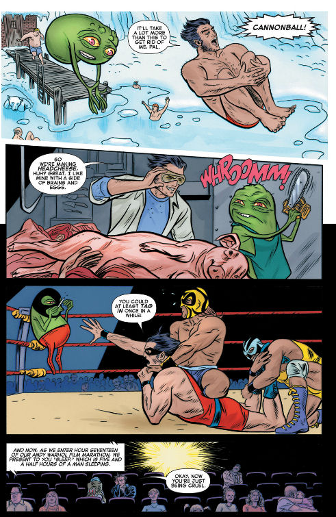
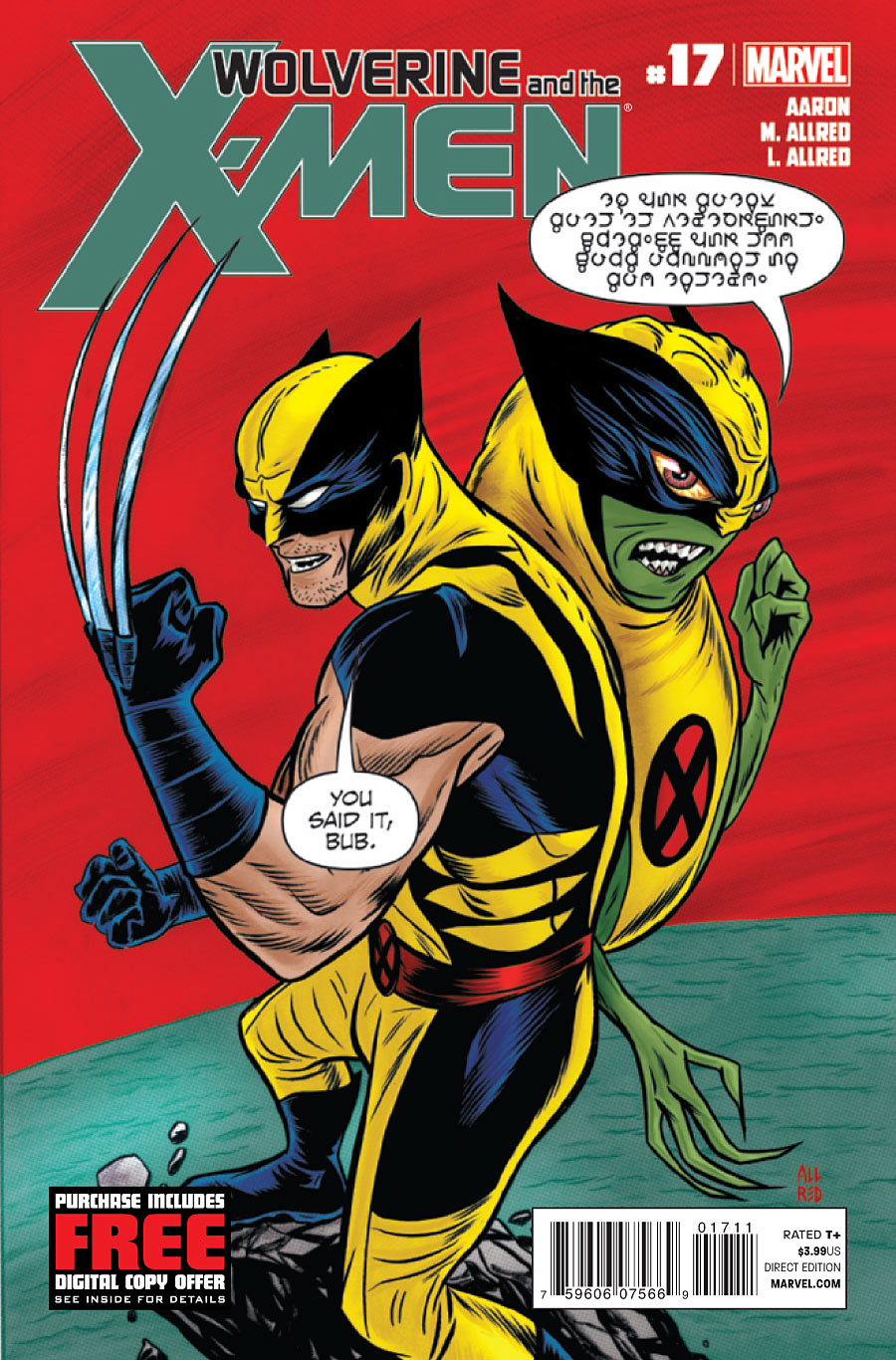
    If you are keeping track you know I didn’t like the last issue of Wolverine and the X-Men because it was like the Holy Roman Empire (which was neither holy nor Roman nor an Empire).  However I loved the issue before that.  Well we are back up again.  I thoroughly enjoyed this issue.  Though it seems just dropped in the middle of things.  It’s not got an AvX Interruptus connection like the last few issues or the one that follows.  I think they just had a finished issue and stuck it in here for some reason only the Marvel Star Chamber comprehends.  However, thank goodness they did.  I needed it- a silliness break.  This issue is why Doop is the receptionist at the school when very few understand what he says.

    Credit where credit is due – Jason Aaron, Writer – Michale Allred, Artist – Laura Allred, Colorist – VC’s Clayton Cowles, Letterer – Michael & Laura Allred, Cover Artists – Jordan D. White, Assistant Editor – Daniel Ketchum, Associate Editor – Nick Lowe, Editor – Axel Alonso, Editor in Chief – Joe Quesada, Chief Creative Officer –  Dan Buckley, Publisher – Alan Fine, Executive Producer.

    All images are the property of their owners I reproduce them here under the Fair Use Doctrine of the copyright law for commentary and critique. No more than three pages total from any one issue is reproduced.

    Okay this stand alone issue is just fun. The summary of story to this point says it all for how to take this issue “Lots of things happened, but don’t worry your pretty little head about it. ENJOY!” Yep that sums up the who why Doop is on the staff of JGS.

    Despite Logan saying in the  Just Another Day in Westchester that he didn’t want any secrets from his staff.  Well, he’s got one – why he hired Doop.  They are asked to just trust him on it.  As Doop doesn’t seem to do any thing – get in their way or cause trouble – the staff accepts this.  We see the real reason and just the lengths Logan had to go to to get the little green guy behind the reception desk.

    Just so you know, I still hold fast to my rule no aliens in my X-Men.  I stick my fingers in my ears and go la-la-la-la-la then Doop becomes just another mutant.  True he’s an odd mutant that speaks his own Doop language that few understand. BUT in my book just like Warbird and Kid Gladiator – he’s another mutant. We see Doop is a man about town and does get around the Marvel Universe more than any one else.  Then again it’s kinda what he was hired to do… sorta.

    The story is light, it’s fun, and it makes me laugh.  That’s good on occasion given the heavy results of AvX that will be hitting the school.  It is school centric and involves staff of the school.  So I’ve got all I need when it comes to story.

    The art is fun and fits the issue.  It’s cartoony but that suits the silliness of the issue.  I don’t know why Logan’s hair is purple black instead of the traditional blue-black but I consider it’s one of Doop’s employment conditions and move on.  Over all I found enjoyable and supporting the story at hand.  Which is what comic art is supposed to do!

    *** More Scans this time That Could Be Spoilery***YOU ARE WARNED********

    WXM 17 Not leaving

    When Logan goes to hire Doop, Doop refuses to take the job. Logan swears he’s not leaving until Doop agrees. This leads to funny pages where Doop is trying to get Logan to leave by sitting up silly job conditions. This page is the start of that.

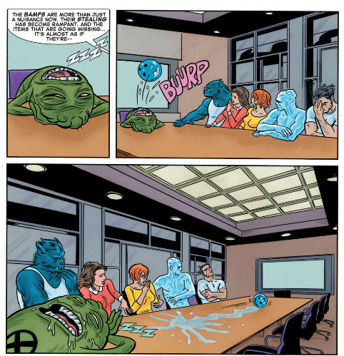
    WXM 17 sit com table sitting

    Just two questions come to mind from this scene – first off what are my dear Bamfs doing? Second why did the whole senior staff sit on the same side of the table. Did they think they were having dinner while being in a sit-com?

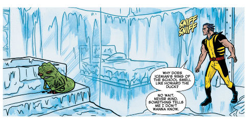
    Wolverine smells Howard the Duck on Doop

    Sometimes you just don’t want to know Logan, really you don’t.

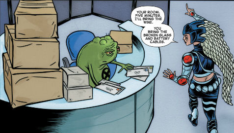
    sitting in a tree k-i-s-s-i-n-g...

    Okay I’m not sure which couple is stranger – Husk and Toad or Doop and Warbird – Xavier warned Logan before the school officially opened about fraternizing among the staff. Also just who do you think Logan was with in the old Danger Room? hmmm? been referenced in several issues that he was with an X-Woman in the danger room… bet it was Ororo.

    Until next peeps.

  • Comic Comments – An Issue I Don’t Care About

    Comic Comments – An Issue I Don’t Care About

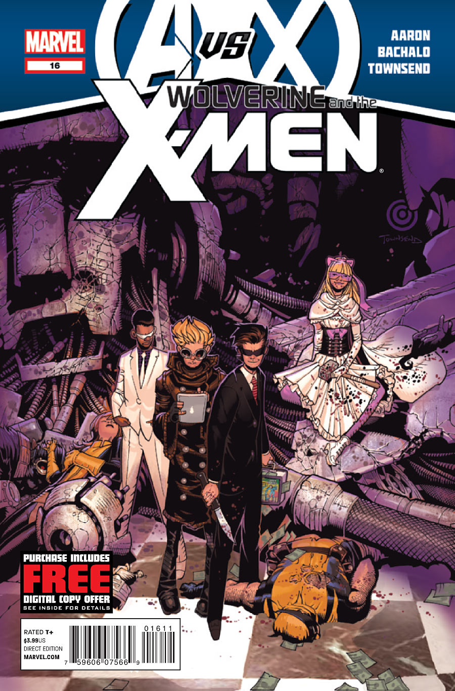
    Wolverine and the X-Men Issue 16 Cover

    From loving last issue to hating this one.  For all the reasons I praised the last I’ll criticize this one.  It has nothing, nothing at all to do with the Jean Greay School for Higher Learning.  It’s all about the stupid concept of 11 years olds being the HellFire Club.  Nope don’t like it at all don’t care about how they came to be, don’t even want to acknowledge they exist if I can help it.  Then to top off the totally irrelevant story line is the very style of art I don’t like.  I think you get the gist of how this is going to go after the legal stuff and credits are out of the way.

    Next we need to get the legal statement out of the way – All images are the property of their owners I reproduce them here under the Fair Use Doctrine of the copyright law for commentary and critique. No more than three pages total from any one issue is reproduced.

    The credits are as follows. Jason Aaron, Writer – Chris Bachalo, Penciler and Colorist – Tim Townsend, Jaime Mendoza & Al Vey, Inkers – Chris Eliopoulos, Letterer, Chris Bachalo & Tim Townsend, Cover – Jordan D. White, Assistant Editor – Daniel Ketchum, Associate Editor – Nick Lowe, Editor – Axel Alonso, Editor in Chief – Joe Quesada, Chief Creative Officer – Dan Buckely, Publisher – Alan Fine, Executive Producer.

    Okay you get that my first issue with this The Fires of hell A-Glowing story is it has NOTHING to do with the reason for the title – the school.  That’s pretty simple really.

    Next I have issues with a Hell-Fire Club that is made up of children no matter how precocious they are in killing or anything else.  First off the real Hell-Fire Club isn’t for children at all.  It did lead to the Phoenix Society all tied into the inspiration for the original use of these names in the Marvel story that spawned all the knock-offs and repeats we have gotten over the years in the Marvel titles.  The Hell-Fire Club NYC was NSFW (not safe for work) and into BSDM.  That’s why in the Marvel comics back in the day you saw the women in corsets with whips.  So 11 year olds taking ove the club – don’t buy it for a second.

    Next I don’t really care about any of these characters, where they are or what they have been through.  I don’t care about how they got to be the club or how Kade became the leader.  If they enroll in JGS as real student I’ll be somewhat interested.  Until that day go away kids you annoy me.

    As of the art, I do not like Bachalo’s style at all.  However either I’m developing a tolerance factor of he’s toning down his extremes.  He still likes pointy feet as much as Liefield likes tiny feet and pouches on belts.  Bachalo has a tendancy to make the angle from the ground or low looking up.  I don’t know if he’s Danny Devito short or what.  As a photographer I know this is an unflattering angle to anyone.  It broadens the facial features and stress the chin which isn’t a favorable facial feature.  Might explain Bacchalo’s penchant for extreme chins and mouths though.  I just don’t like it.  I guess that’s why I’m relieved when any other artist takes an issue in the title.  Except Liefield please no not Liefield…  he might be a great guy (as Bachalo might be) but neither is to my taste in comic book art.

    So I went from cudos to why did they waste an issue on that?!?  Wonder what the next issue will bring.  Well best to go up from the bottoming out don’t you think?

    ***SPOILER INTERIOR SCAN***WARNING***POSSIBLE SPOILERS FOR THOSE WHO CARE*****************************************************************

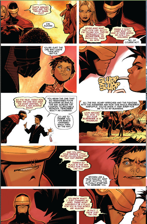
    WXM 16 kill them Scott PLEASE

    No he didn’t sent him to Logan’s school. You know if Scott had killed this stupid kiddie Hellfire Club it’s almost made AvX Interruptus worth it for me. Just to get rid of this annoying group.

    Like I said I didn’t like it. Said that in enough ways to put the issue in the file box and never read it again. Time to move on, Until next time…

  • Comic Comments – When A Hot Date Goes Bad

    Comic Comments – When A Hot Date Goes Bad

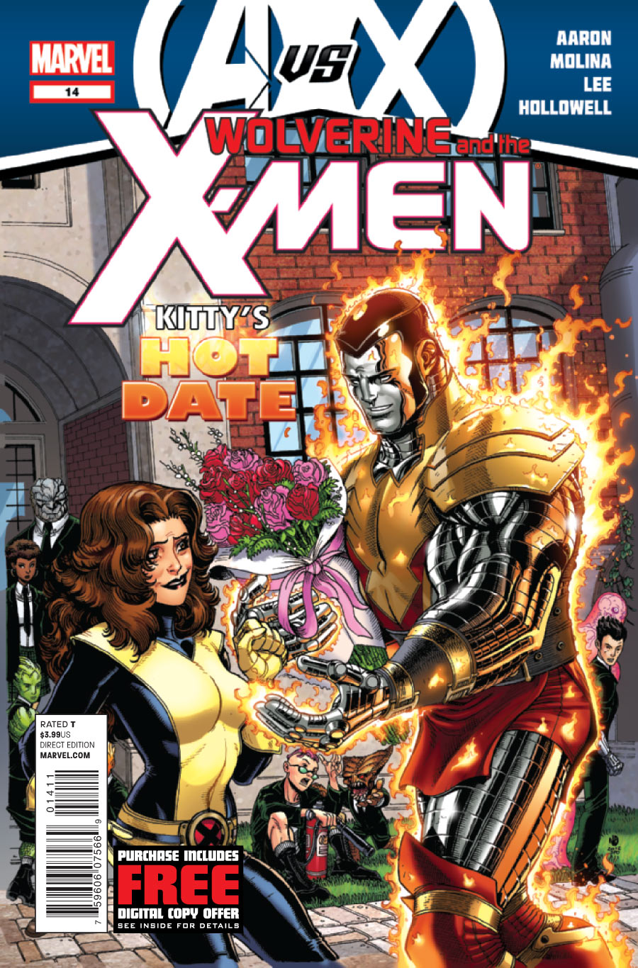
    WXM 14 Cov

    This is a decent tie-in to the AvX.  If you’ve been reading you know my issues with AvX and I’m not following it beyond when it interrupts my pull list.  This falls into that category.  However I will say this issue is much better than the last issue which didn’t center on the school AT ALL.  This centers on the school even though it’s a date between Kitty and Piotr (Colossus who is possessed with the Phoenix).  We see the strain on the staff to have Hank, Rachel, Bobby, and Logan all off in the stupid war.  We also see the strain between Kitty and Piotr differences over the school concept as well as the Phoenix force.

    All images are the property of their owners I reproduce them here under the Fair Use Doctrine of the copyright law for commentary and critique. No more than three pages total from any one issue is reproduced.

    The creative team for the issue is as follows: Jason Aaron, Writer – Jorge Molina, Penciler – Norman Lee, Inker – Morry Hollowell, Colorist – Chris Eliopoulos, Letterer – Nick Bradshaw & Justin Ponsor, Cover Artists – Jordan D. White, Assistant editor – Daniel Ketchum, Associate Editor – Nick Lowe, Editor – Axel Alonso, Editor in Chief, Jow Quesada, Chief Creative Officer – Dan Buckley, Publisher – Alan Fine, Executive Producer.

    Since the Scott/Logan issues from Wolverine and the X-Men title this is the best.  That’s not saying much really but it’s something.   This one like those centers on the school and tell how the AvX interruptus effects the staff and students at the school.  Let’s face it I come to this title to read about the school, preferably Logan and his staff, students and how they interact AT THE SCHOOL he founded.  I don’t come here to read about some alien race fighting the Phoenix force or some big sales pitch multi-title arc.  This issue gives me what I buy the book to read and for that I am thankful.

    There are many plot threads here that are developing – the return of staff that sided with Scott at first but don’t like what he’s become.  Will the be welcomed back or turned away?  Toad’s collecting Husk’s discarded skin and playing house with them.  That’s gotta surface in some odd way some time.  The relationship of Bobby/Kitty and  Pitor/Kitty which is the future and will the headmistress stay at the school or go for a man?  Oh and how is the school coping with so many of the staff gone?  What if they are attacked when at low staff will Logan’s edict of ‘kids don’t fight’ stand?  All great plot threads started in this issue and all centered around the school at the school.

    While I’m in what I like/don’t like mode let me say I still don’t like Colossus being alive.  Nope I don’t.  When he was brought back in Ultimates I thought it was a disservice to his character that made a noble sacrifice to kill a virus that was deadly. I thought okay this is a separate universe I’ll go with the what if he survived in the Ultimates but don’t dare bring him back in the main 616 universe. But some how it bled over – why some things that happen in the Ultimates stay in the Ultimates and don’t bleed over but other stuff does is beyond me.  It makes no damn sense.  Then to bring back a character that performed a heroic death only to make him the monster he’s been becoming over the last year I don’t like at all.  In my book Piotr is dead from the virus stayed dead and is a noble hero.  Don’t care about the Ultimates any more and if he lives over there so be it.  Don’t cross streams Marvel and for gosh sakes DON’T CROSS STEAMS ARBITRARILY!

    As for the art – VAST improvement over the first arc in this line where it was so busy I had to cling to dialogue to tell what was happening in the story.  There is no distortion of mouths or hands, no curling greyhound-ties, no pointy feel girls.  It’s good solid art that I enjoyed VERY MUCH.  I do think the color palette was a bit too far on the light or pastel side.  I enjoy bolder colors but it didn’t bother me at the school so much as in the date scene.  As for the cover, I love that art.  Oh please please let that team do a few arcs in the story some time.  PLEASE for me…

    In the end I liked the story for what it was a forced tie-in from the title to the overall marketing arc that was undoing the House of M stuff for now at least.  I’ve learned don’t count on Marvel to ever do much that lasts or is new and lasts.  They almost always go back and forth on the same road.  Yet hope does spring eternal and I hope that one day they will grow up and move beyond that.  If only the money would let them.

    As for this title there’s a few more AvX interruptus issues then they get an arc of their own.  Shall we hope it’s as good as Alpha and Omega was?  ohhh dare I hope even BETTER!  Yes yes I’m climbing down I won’t go over the edge into insanity.

    *** a few scanned pages that might be deemed spoilery** I didn’t want to spoil how the date went so here’s the staff meeting I enjoyed more than the date any way.

    (more…)

  • Comic Comments – It’s Simply Nuts & Bolts from Another Planet

    Comic Comments – It’s Simply Nuts & Bolts from Another Planet

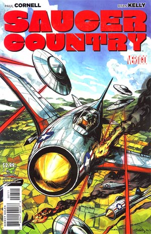
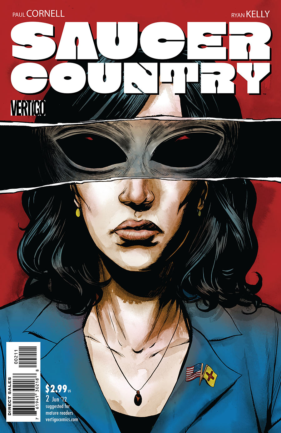
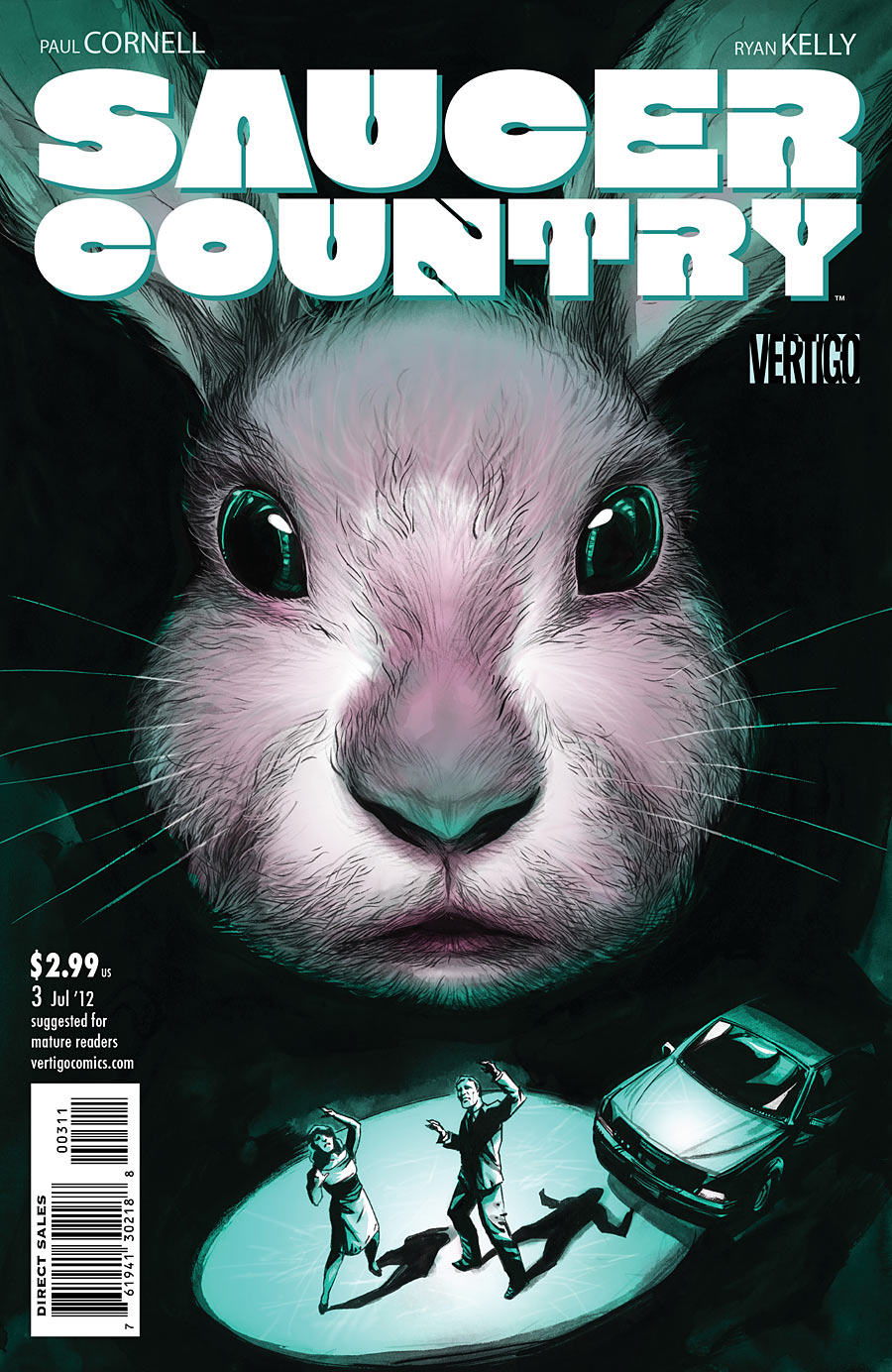
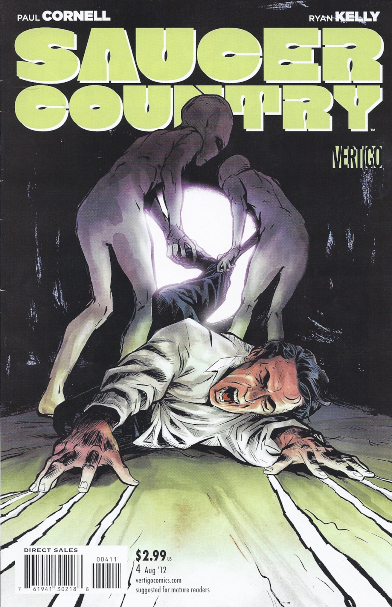
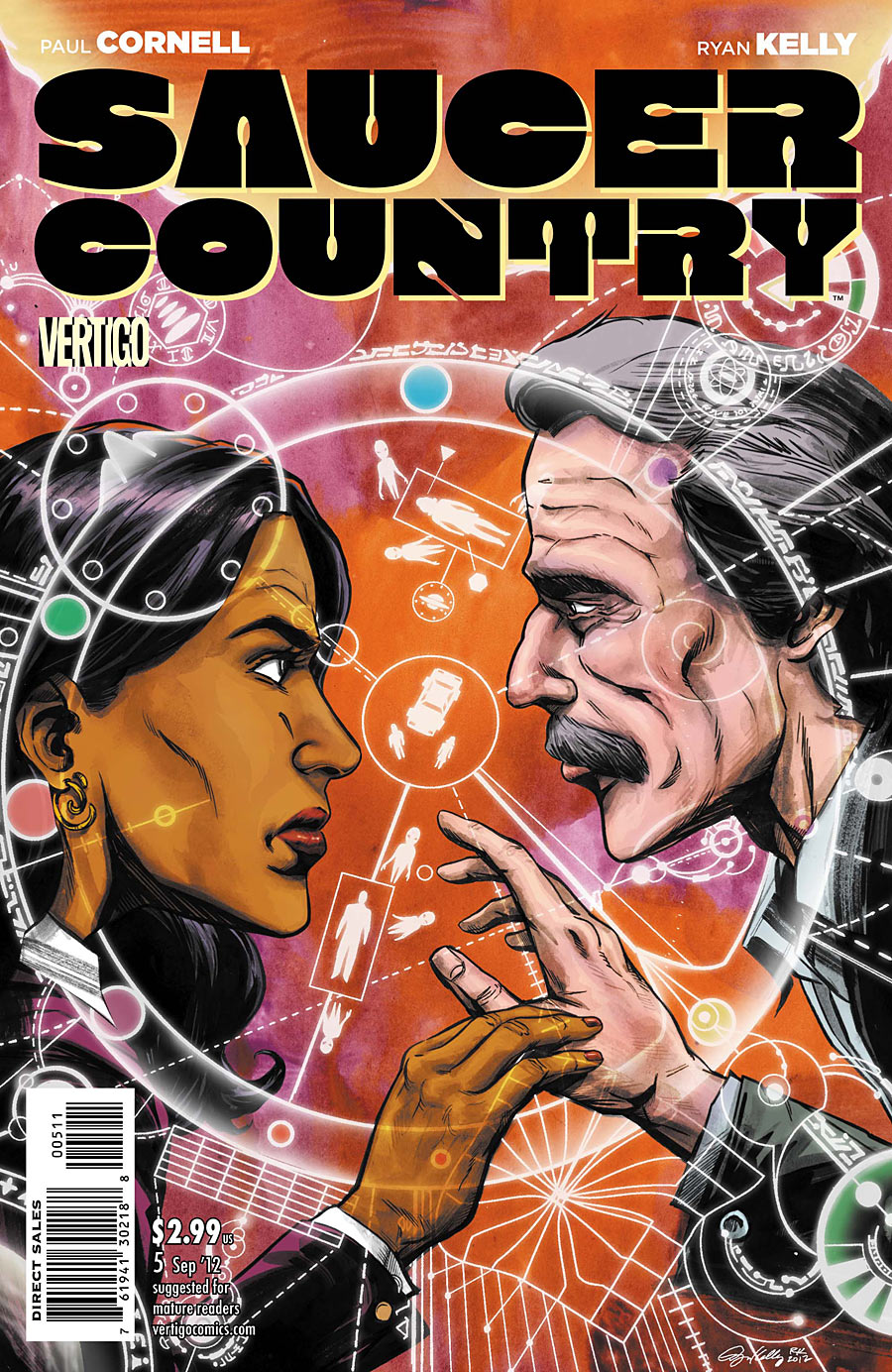
    As you can tell from my previous Saucer Country reviews I am highly impressed with this comic thus far.  I even went back to get the first complete arc before going on with the next stand alone issue.  This issue is Saucer Country: The Bluebird Perspective  another stand alone that is a companion piece to  A Field Guide To Flying Saucers that was issue 6.  In that issue the Professor introduced us to the lore of alien beings visiting humans.  Here a group of scientists and engineers have taken the the perspective that yes UFOs do exist and they are actual spacecraft from another planet or dimension.

    the required legal statement – All images are the property of their owners I reproduce them here under the Fair Use Doctrine of the copyright law for commentary and critique. No more than three pages total from any one issue is reproduced.

    The creative team for the issue is as follows: Paul Cornell, Writer – David Lapham, Art – Giulia Brusco, Color – Sal Cipriano, Letters – Mark Doyle, Associate Editor – Will Dennis, Editor – Saucer Country created by Cornell & Kelly.

    We are introduced the Bluebirds through the new member Astelle Johnson a rising star in aerospace design. We’ve seen her in previous issues at a meeting being introduced and using the Bluebirds’ computer hacks to follow just what Professor Kidd is doing with the Governor’s campaign. Good plot thread connections coming together into a bigger picture here. That takes writing skill and Cornell shows he has that in every issue.

    In this issue we learn that the Bluebirds were founded by WWII vet Joe Bermingen an RAF officer who saw Foo Fighters (no not the rock band the  UFOs reported by allied pilots in WWII).  He knew from his sighting that they weren’t Nazi test craft but alien.  From there his life was centered on engineering craft like it and later upon finding crashed alien craft and back engineering it.  The further the story goes the stranger it gets, but Astelle listens trying to understand it all just like us the reader.

    This book does well to weave together all the various thoughts on the belief that UFOs aren’t paranormal but real machines to bring aliens here.  It is ironic that the Bluebird spokesman dismisses Professor Kidd’s mythology with a grain of truth approach as going down the rabbit hole, given how far down the rabbit hole the story of Joe Bermingen goes.  By the end of it even Astelle is left asking her mentor “Do you believe?”  Science doesn’t need belief that’s an issue of faith – something Professor Kidd is investigating.  So just like all the various lines of thought and mythology around UFOs in the real world become vastly inter tangled so do they in Saucer Country plot lines.

    The story isn’t confusing at all Cornell has composed it well so that we the reader can follow Astelle, the Governor, and Professor Kidd down the rabbit hole without question.  It all leads us deeper into his story of what happened to the leading Presidential candidate and her ex-husband that night in the New Mexico high desert?  Will it change the election?  If elected will that experience that changed her life change the world as a result of her Presidency?  Just what is the truth of it all? I’ll keep reading for answers which is more that I ever expect to get in real life.

    The art is up to the high standard as usual.  I’m intrigued by the Bluebirds coming into the forefront of the tale.  I want to know what role they will be playing.  Now to bring the conspiracy group out more and ohh those spooky not quite human like but human non the less men in black we see here and there in the story. Lapham is excellent in working in Easter Eggs and visual hints to later issues in his art.  I’m sure the SERPO screen we’ve seen Astelle viewing will come into play.  Along with the fact that there are visual hints the Men In Black aren’t really men.  The manner he handles the illustrating of the Joe Bermingen story is fantastic and just shows us enough to question what the rest of the story is, what did Joe really see as a Foo Fighter?

    Well written story getting more complex but leading the reader on to more coupled with excellent art that adds more visual clues to the story telling makes this one of the best comics on my pull list. In short Vertigo has hit another home run with this issue.

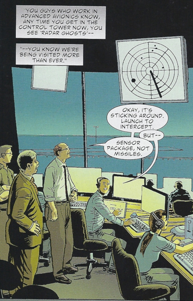
    Excellent scene that pulls on reality. It is true that control towers get radar ghosts they cannot determine the cause. I’ve talked to a few people in the industry most feel it has to do with weather and the earth’s own electromagnetic field. I’ve been told the newer systems are set up to filter out this anomalies. There are others who wonder if this is such a good idea. Should such things just be ignored? That’s where the rabbit hole goes – to tie them into the Joe B. story at the center of the Bluebirds was another great writing touch.

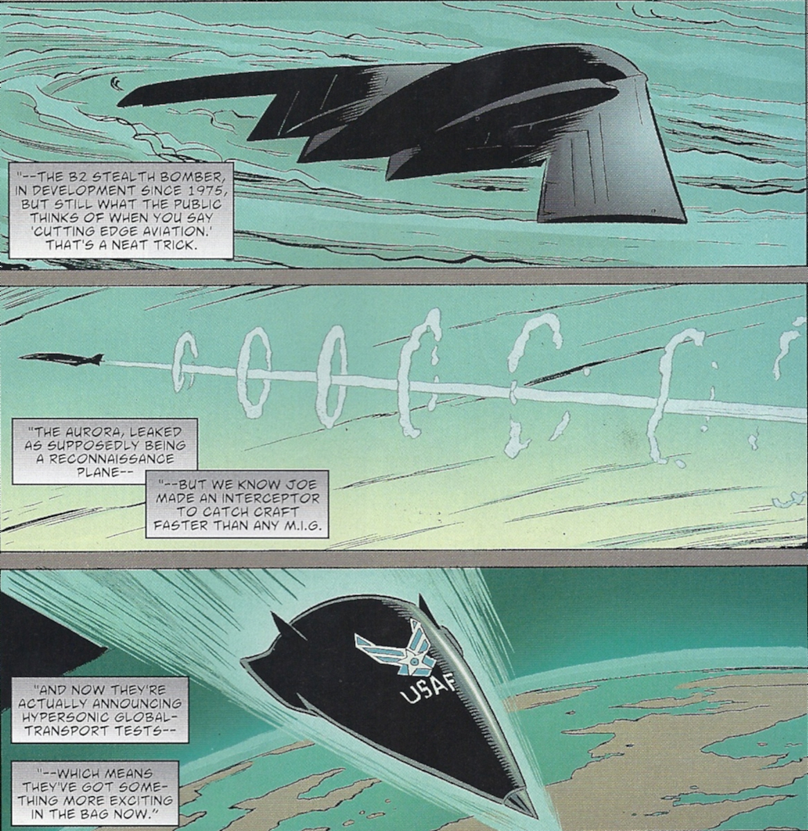
    experimental classified air craft identified as UFOs

    This draws on the theory that what is seen is actually top secret craft being flown. Before the Stealth lines were de-classified there were reports of triangle shaped UFOs – were these the stealth planes? Aurora is a line in the US budget for top secret military something. Retirees from the real area 51 contend that yes, yes it is. Again another excellent job writing in another of the ideas of UFOs into this story and illustrating them well.

    I can’t wait to read issue 8!

  • Comic Comments –  The Aliens Have Me

    Comic Comments – The Aliens Have Me

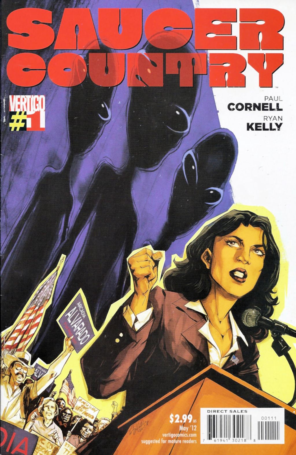
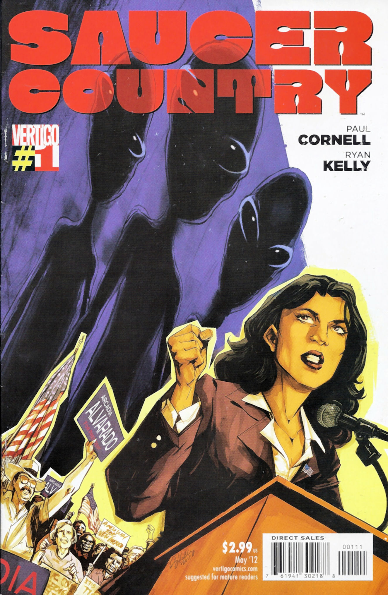
    Saucer Country Issue 01 Cover 1st printing

    I’d heard good things about Saucer Country from the first issue.  When I read that issue 6 was a good jumping on point, I jumped.  I didn’t regret it.  Honestly that issue was strong enough to put the title on my pull list and send searching for issues 1-5. The first arc of the series is entitled RUN.  Just like the excellent writing in this book the title has layers of meaning and can apply to the high strangeness of the story or the mundane.  That’s what makes this book so compelling it’s written with all the complexity, tightness, and layers of an excellent science fiction thriller.

    Saucer Country Issue 02 First Printing

    All images are the property of their owners I reproduce them here under the Fair Use Doctrine of the copyright law for commentary and critique. No more than three pages total from any one issue is reproduced.

    Now the creation team: Paul Cornell, Writer – Ryan Kelly, Art & Covers – Giulia Brusco, Colors Issues 1-3 & 5 – Guilia Brusco & Lee Loughridge, Colors Issue 4 – Sal Cipriano, Letters – Mark Doyle, Associate Editor – Will Dennis, Editor – Saucer Country Created by Cornell & Kelly.

    The story centers around Arcadia Alvarado the Governor of New Mexico who is the leading Democratic candidate for President. She and her ex-husband had a strange experience in the desert that is causing strange flashbacks for her and emotional disruption for him. This first arc deals with two types of running – Gov. Alvarado deciding to run for President and her ex-husband running from his memories of that night.

    It is a nice contrast between her reaction and his to their shared missing time experience. He’s terrified but she’s determined to get to the bottom of it. At first their paths diverge. He goes to a known hypno-therapist that specializes in alien abductions. She confides to her campaign manager and personal assistant saying she doesn’t want it to go public but wants answers. They turn to a Harvard professor that studies mythology believing the UFO phenomena is modern mythology with some truth in the center spawning it all.

    Eventually the two paths conjoin again but not without first going through many of the common threads of the UFO/Alien abduction discussion. More angles are brought to play by new characters. The arguments that the hypno-therapist leads the subject comes into play. The conspiratorial/disclosure group that believes the government not only knows about the aliens but may be in cahoots with them show up. The UFOs are nuts & bolts from another planet are represented. The concept that it’s inter-dimensional/paranormal occurrence is there. The hostile alien take over contingent has it’s thumb in the story pie. The friendly human like aliens here to guide us past our warring ways are in the waiting room too. The remarkable and impressive thing is Cornell weaves all these things together in a riveting compelling story.

    I must praise Cornell for researching the topic well. He’s got it all and woven it together seamlessly without making it a confusing mess. That’s talent as a writer. The layers of story going on is impressive along with the number of players that are converging but not confusing the plot. At the core of his story is the unknown event where what’s true and what’s fiction blur as much as reality and fantasy for the characters. Much applause to him and I’m anxious to see where he takes us next.

    The art is excellent and among my favorite art in current titles. I like the realism with just enough comic flare to make the people seem believable but still better than real life. The flashes into the alien memories, thoughts, and concepts are well done to evoke the feeling of the character experiencing them. From the evil torturing aliens to the friendly guiding ones that reveal cues to the future – all are beyond normal but yet fit their roles. The excellent execution blends well and supports the fantastic writing.

    This title is firmly planted on my pull list. This along with several other new titles coming along are proof that excellence in writing and art will create a buzz in the comic community. You don’t need a big franchise or formulas to sell comics the first print of these sold out quickly and even went into 3rd printings on some issues. Comic book fans are hungry for great art and stories. The big guys are meeting the market for it but the small guys are. Saucer Country didn’t only meet the market it made a slam dunk!

    **YOU KNOW WHAT’S NEXT POSSIBLE SPOILER SCANS** Enjoy!

    (more…)

  • Comic Comments – Ghost of An Old Friend

    Comic Comments – Ghost of An Old Friend

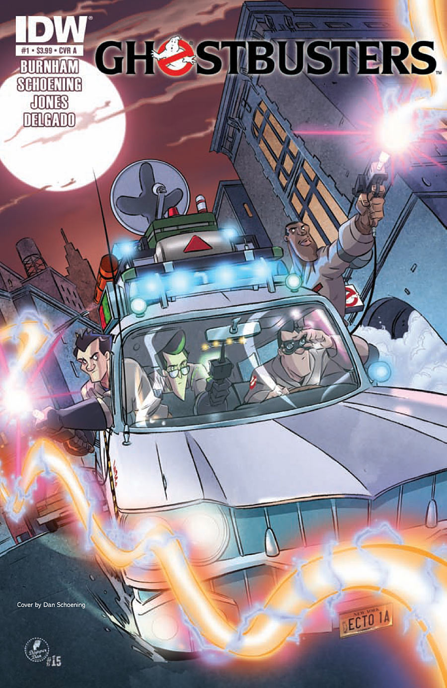
    Ghostbusters Issue 1 Cover

    I loved Ghostbusters when it came out. It was the summer after I graduated high school.  I think I saw it four times in the theater with various groups of friends.  Years later when DVD technology came into our home it was the first DVD I ever bought.  I wanted to introduce Aaron to the fun that was Egon, Peter, Ray, and Winston.  That’s why I put the comic on my pull list when I returned to comics.  Unfortunately I jumped on at issue 4.  This arc covers issues 1-4.  I was set for the next arc which I loved (and was commented upon at my G+).  So I had to go back and get issues 1-3 to complete this arc.  That took some doing as it was sold out, but I finally got the issues and read the whole arc.  It’s good to have the gang back together and complete.

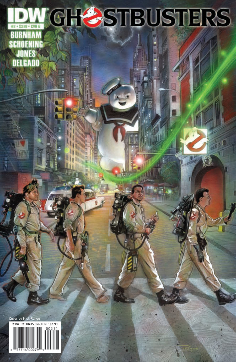
    Cover inspired by the Beatles Abby Road cover

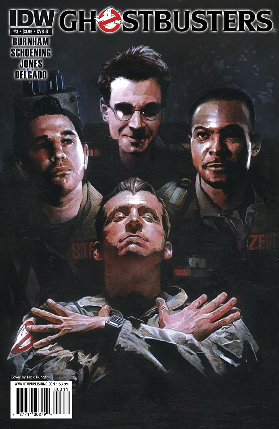
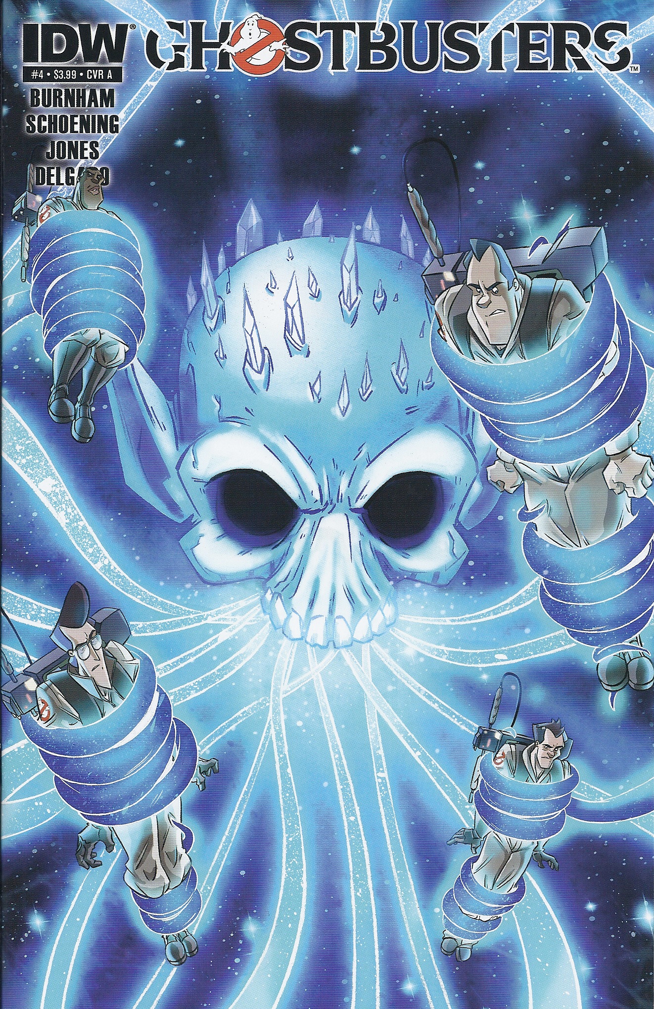
    First let’s credit the team that built this arc: Erik Burnham – Writer, Dan Shoening, Artist – Luis Antonio Delgado, Colorist – Tristan Jones, PCOC Pages – Shawn Lee, Letterer – Bobby Curnow, Associate Edits (Issue 1) – Tom Waltz, Editor.  Now for cover credits by issue.  Issue 1: Cover A (pictures here) – Art by Dan Schoening, Colors by Antonio Delgado – Cover B Nick Runge – Covers RIA & RIB Art by Dan Schoening, colors by Antonio Degado.  Issue 2: Cover A – Art by Dan Schoening, Colors by Luis Antonio Delgado – Cover B (pictured here) by Nick Runge – Cover R1 Art by Dan Schoening, Colors by Luis Antonio Delgado. Issue 3: Cover A – Art by Dan Schoening, Colors by Luis Antonio Delgado – Cover B (pictured here) by Nick Runge – Cover R1 by Tristan Jones. Issue 4: Cover A (pictured here) – Art by Dan Schoening, Colors by Luis Antonio Delgado – Cover B by Nick Runge – Cover R1 art by Erik Burnham, Colors by Luis Antonio Delgado.

    Next we need to get the legal statement out of the way – All images are the property of their owners I reproduce them here under the Fair Use Doctrine of the copyright law for commentary and critique. No more than three pages total from any one issue is reproduced.

    This whole story centers on the moment in the first movie where Ray chose the StayPuf Man to be the Destructor for Gozer. This led to the ending we are familiar with and made the GBs a world hero and franchise.  All is well that ends well right? Uh for everyone but Gozer.

    Queen II inspired cover

    This arc centers on Gozer trying to get a second chance to enter our plane of existence.  The first step is getting Ray to select something a bit more ominous.  Ray has an ally in this his fairy godfather – Jake Blues.  Yep the John Belushi character of the Blues Brothers.  With Jake on your side you know you are going to win!

    Through out this second chapter of the Gozer story there are connections to the movies.  Slimer makes another appearance.  We see the Carpathian’s painting in the background of some scenes.  Mr Peck from the EPA (yes the dickless wonder) gets a new job from the Governor of New York.  It’s all good if you love this universe.

    This art is fun and cartoony.  I don’t mind because honestly so were the movies.  It all fits nicely into the universe and carries forward the story much better than the animated series did.  I can see some influence stylistically from the series but it is not too much.

    Ghostbusters Issue 4 Cover A

    Finally the covers – the Cover B series draws inspiration from famous band album covers.  There’s the Beatles Abby Road Album on Issue 2, and Queen II on Issue 3 pictured here. The alternate for Issue 01 was KISS Destroyer inspired.  Issue 4 moved into TV shows with the R1 cover inspired by the Brady Bunch.  I enjoyed seeing the thumbnail of the ones I didn’t purchase. Yet,  I won’t be getting into the collecting of cover variations.

    In the end I loved it.  It’s like the Dark Shadows comics for me a visit to something I loved at a younger time in my life.  With the rumor mill churning on GB III announced to start production in 2013 this is a fun way to fill the time and get excited for the next movie in what has become a comedy cult classic.

    ***YOU KNOW WHAT’S NEXT*** POSSIBLE SPOILER SCANS***

    (more…)
  • Comic Comments – When Men Are The Fairest

    Comic Comments – When Men Are The Fairest

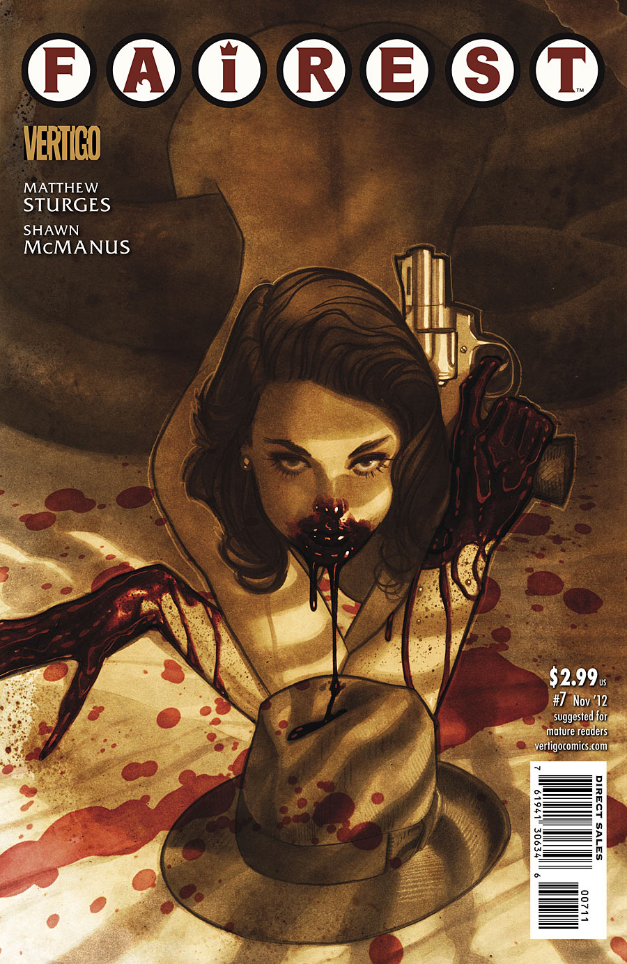
    Fairest Issue 07 Cover

    I was looking forward to this issue of the Fairest from the previews.  The stand alone issue is entitled Lamia. It’s a noir crime story told with the Fable characters and set in the 1940s LA.  Think LA Confidential  but with Fables Beast taking the lead detective role.  Yes that’s right this issue of Fairest centers on a male character.  He’s off to capture a female dragon that he has been containing every few decades since the fables took refuge in the mundy world.  As always he’s teamed up with St. George to contain the threat.  I have to say the story is excellent.  The twist at the end left me shocked so much I had to read it twice.  The old ‘did that mean what I thought it meant?!?’ reader’s double take.  Cudos to Matthew Sturges for penning such an awesome story.  I PROMISE no spoilers or hint of spoilers on the great twist.

    Speaking of the writer Matthew Sturges, I’d like to acknowledge all the people that made this awesome issue happen. Shawn McManus – Art & Colors, Todd Klein – Letters, Adam Hughes – Cover, Gregory Lockard – Assistant Editor, Shelly Bond – Editor, and Bill Willingham – Creator & Consultant.

    Next we need to get the legal statement out of the way – All images are the property of their owners I reproduce them here under the Fair Use Doctrine of the copyright law for commentary and critique. No more than three pages total from any one issue is reproduced.

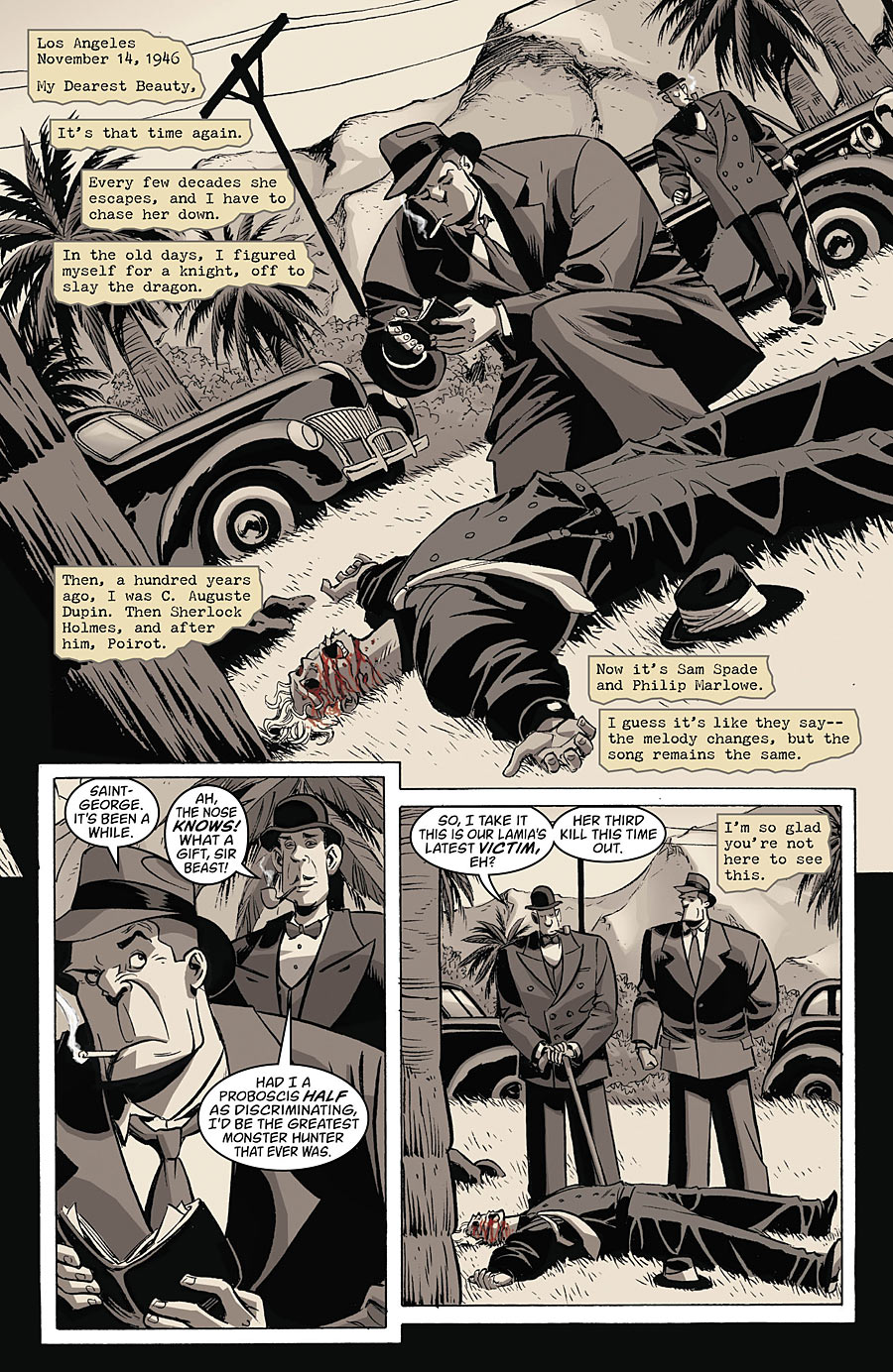
    Ahh the story – a female dragon named Lamia is loose in the mundy world again.  It is in November of 1946.  Beast and St George team up again but this time under the names Sam Spade and Philip Marlowe.  We learn other famous literary detectives through the years have been Beast and St George working to contain Lamia when she escapes.

    Now you’d think the mundies like us would notice a big green scaly lizard taking victims in 1946 LA.  Ahh but one of Lamia’s powers is she can transform into a beautiful woman.  This is why all her victims are men and how she lures them in.  The story is of her containment yet again.

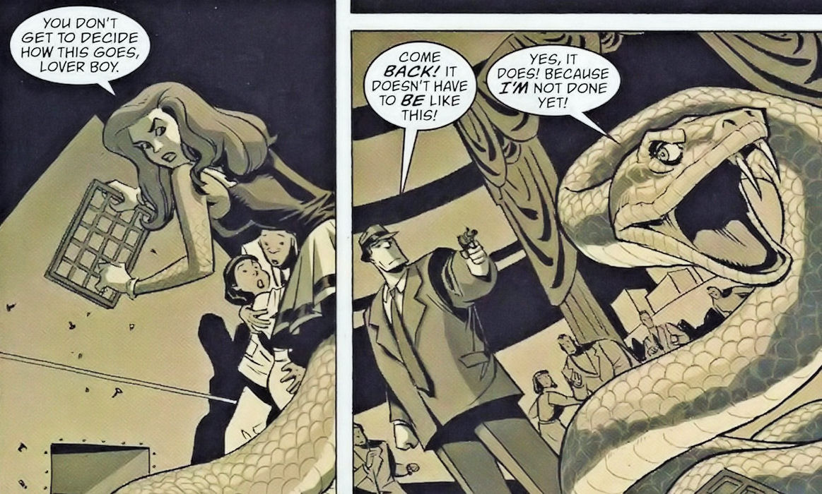
    The art of the issue supports the noir crime theme excellently.  The panels are either the cool grays or sepia tones of yesteryear. The only exception it to add the color red. This is used well not to be a gimmick to highlight the gore of Lamia’s kills but also to add to the neon and other things of the time.  It isn’t over done at all.  It’s actually very restrained adding to the power of the just one color pop.  Adding the over all dark depressing feel that such a requirement for noir crime.

    I don’t rate comics when I review them.  Because I don’t want to become the arbitrator of what’s good and what’s not.  I’m here to share my opinion on the books.  It might be a great comic and I know that but I don’t care for it.  How do I rate that?  However I’d have to say this one comes down to being a 10 out of 10 for me.  It hits all the right notes I want when coming to a comic for a story.  Great art, excellent writing, well done plot, and twists within twists at the ending.  Bravo! to the Fairest team for making this one of my must reads.

    ** NOTE NONE OF THE SCANS BELOW SPOIL THE TWISTS**  I chose scans that more display how wonderful the use of art was with the story.  I am limiting them so I don’t spoil the great plot surprises along the way.

    Shows the start of the story as Beast types a letter home to Beauty

    As you can see part of Beast’s narration of the story appears as a letter home to Beauty. Here you can see how the gray tones and the touch of red add to the feel of the story and highlight the noir setting.

    Lamia transforming from woman to her snake-like image escapes

    Here we see Lamia transform as she escapes from Beast. She sheds her woman appearance to slither out a vent.  Here the art moved from the grey hues of the top page scan there to the more sepia tones of the interiors. Since this issue is mostly in those tones sepia indicates indoor settings and greys outdoor.

    Again this was an awesome issue.  If you are interested in getting into comics but aren’t into the superhero idea do try Fairest or its parent comic Fables.  Both are excellent!

  • Comic Comments – Deadpool Can Die

    Comic Comments – Deadpool Can Die

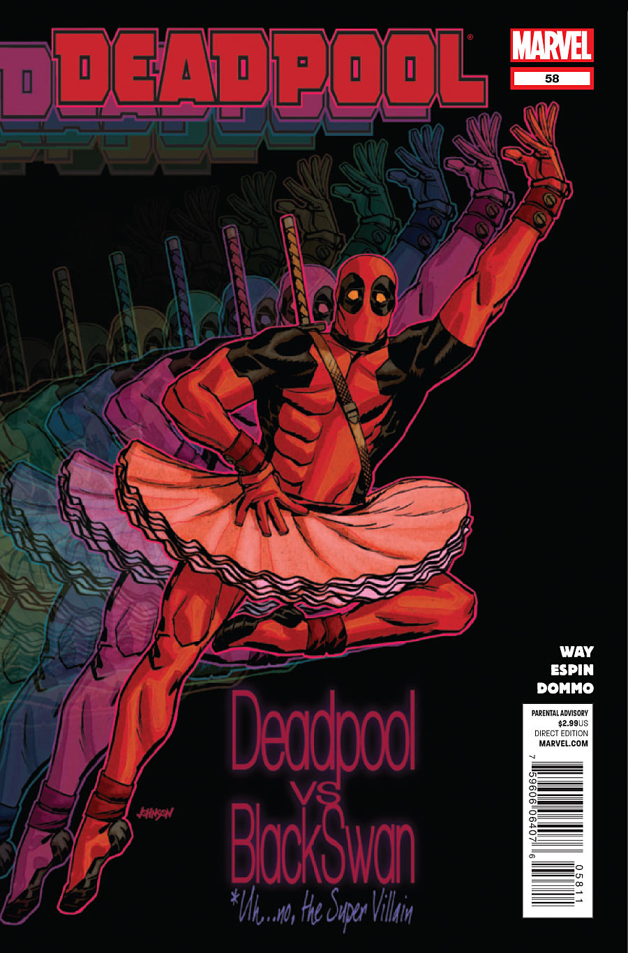
    Deadpool in a tutu  title Deadpool vs Black Swan

    When we left Deadpool he was ‘cured’ of his healing factor and handsome again. Now he’s honing his skills as he got soft healing from injuries. BUT now that he is killable his enemies would like to oblige. Thus starts this three issue arc entitled Blacklisted.

    First the legal stuff: All images are the property of their owners I reproduce them here under the Fair Use Doctrine of the copyright law for commentary and critique. No more than three pages total from any one issue is reproduced.

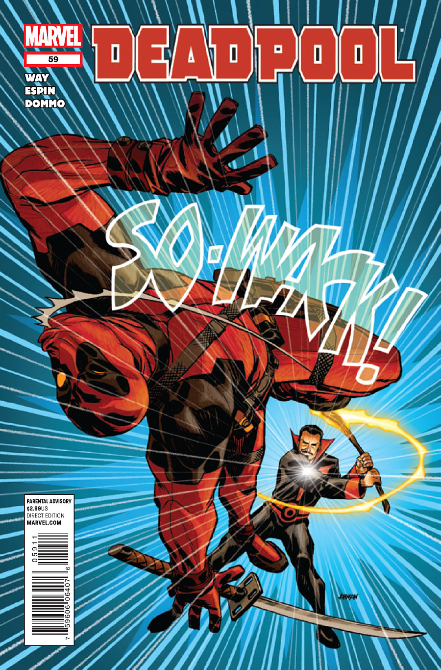
    Black Tom Cassidy whacks Deadpool back toward the reader with a SO-WACK!

    Next credit where credit is due: Daniel Way, Writer – Salva Espin, Artist – Dommo Sanchez Aymara, Colorist Issues 58 & 59, Guru eFX, Colorist Issue 60 – VC’S Joe Sabino, Letterer – Dave Johnson, Covers – Jordan D. White, Editor – Nick Lowe, Senior Editor – Axel Alonso, Editor In Chief – Joe Quesada, Chief Creative Officer – Dan Buckley, Publisher – Alan Fine, Executive Producer.

    This story has all of Deadpool’s enemies who have Black in their name going after him.  Black Box a villain that can control electronics uses social media to notify the villain world that our beloved Merc with a Mouth can die. The hi-jinx ensue from that.

    This was what I look for in a Deadpool comic – comic relief poking fun at the superhero/supervillain genre while loving it too.  Deadpool is crazy and clueless but talented fighter.  His villains are bumbling and would be dangerous if only they could get it together.  Inter cut with all of this is the constant inner dialogue of Deadpool himself the sane and the insane.  Then add his 1980s action movie quips based on current pop culture and you have a fun read.

    Deadpool looks at a tweet on his iPhone from Black Box stating that Deadpool is now killable.

    No when I come to a Deadpool comic I don’t want to see character growth.  I don’t want a tight story.  I don’t want top shelf art.  I want DP to be himself, just like Roadrunner is always himself.  I want a romp of a story that’s amusing, fun, and has action.  I want art that’s a bit cartoony or comical at times.  I have to say this arc gave me all of that. I walked away from the story contented.  I got exactly what I came for and it was fun!

    **Warning** Warning**Scrolling further MAY result in spoilers as I chat about some particular pages from issues **WARNING**WARNING

    (more…)